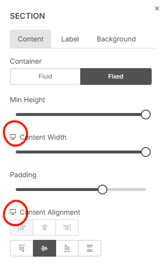
Responsive properties
All responsive settings or the properties that can be changed based on screen size will be labled with a screen icon  or mobile icon
  depending on page editor size.
For example, in the Section settings, the Content Width and Content Alignment are the only responsive settings while Padding settings will be applied to both Desktop and Mobile sizes and padding value will be adjusted automatically depending on screen width.
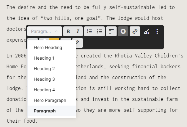
Responsive properties of Text
Text style: Paragraphs and Headings is designed to be responsive by default and automatically adjusting to suit any screen size.
Text Alignment and Font Size: You can set text alignment and font size per screen size, that allows you for example to Align a title to left in desktop screen size and Align the the same title to center in the mobile screen size.